
 |

|
|
|
#4381 | |
|
Blue Psychic, Programmer
Join Date: Feb 2007
Location: Home!
Posts: 8,814


|
That's a great sketch, CJ! Looks like it would be really easy to clean up and color.
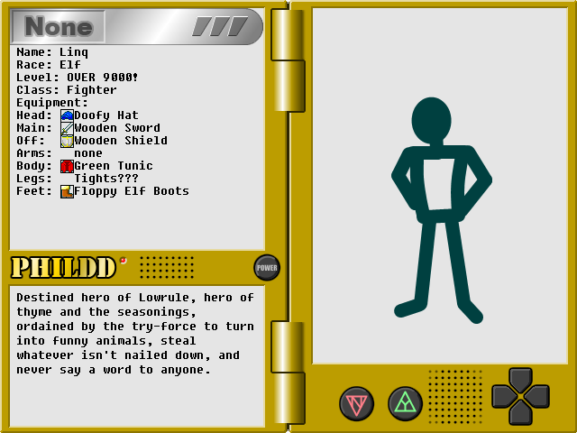
 And Matt, that's just awesome. XD Edit: Here's a mock-up of what the character sheet may look like. I decided to use a pale gray to put text on instead of the blinding white I had before.  I also changed the None banner to look more like it was a part of the top bar, so the window looked like it didn't have anything stuck in it. Also also, I know how I'm going to do my character blocking when I finally get around to doing the avatars. Edit again: Here's a newer mock-up:  It's incredibly messy, sadly. I was using this as a full-on test to make sure everything would fit, and, well, with the ability to wear five rings per hand, it potentially means the last possible slot could get pushed onto the lower screen. Thankfully, tail slots are only used by a specific race that's not a part of the main roster. That's disregarding the possibility of listing ammo equipped to ranged weaponry, but I'll figure it out. The pictures at the bottom are my solution to not having everything on the interface. They're used for the menu, setting up a shop, proposing a duel, giving you a list of all people currently on the screen (it'll be easier than trying to make the player click those tiny markers), interacting with the environment (pick up nearby items, flip switches, etc.), clearing out the buttons to post a short message (local shout, team chat, etc.), and an example of one of a few different buttons expressing different races' abilities to identify important objects or otherwise gather information. The top bar now serves as a sort of "info at a glance" thing, with the character's elemental focus (this is a separate bonus from their innate element), their token (to identify innate element and race), a class token (I did my best to make the icons all self-explanatory and they're further color-coded to identify whether they're a physical, magical, item-based [such as an Engineer], or ability-based class [such as a Thief] class), and user type. If there's anything I learned from Gaia, it's that people are gullible when it comes to identifying people posing as staff, so it's listed there first thing. The original idea was to prefix it to every name, like I have there, but it's ugly and insulting and I think having the chip is just a better idea.
__________________
Quote:
Journal | Twitter | FF Wiki (Talk) | Projects | Site Last edited by bluestarultor; 06-09-2010 at 07:22 PM. |
|
|
|

|
|
|
#4382 |
|
Local Rookie Indie Dev
|
looking good so far blue.
Raiz Sonas
__________________

Last edited by Kyanbu The Legend; 06-10-2010 at 10:40 PM. |
|
|

|
|
|
#4383 | |
|
Blue Psychic, Programmer
Join Date: Feb 2007
Location: Home!
Posts: 8,814


|
Your lines are nice and clean and the coloring is great, but the perspective is wonky. Her far ear should be shorter, her far boob should be higher, and her near knee should be higher.
Edit: So, were you wondering about the empty space on the top bar? There's an icon for that!  Just a generous star to indicate that the person is on your friends list. I wanted something that would take up a bit of space, but not be so cluttered like the dots and tabs are, and a star is good for that. It's also good because stars are the casting bits (as in the little fragments of element that circle you when you cast and double as elemental shots for magical weaponry) for concert spells, which you're only able to do with friends. Also, those are the battle command buttons. Attack, magic, Tech/racial skill, move, item, guard, and a mechanic that warrants explanation. See, there are three flag buttons (all just recolors of each other). Given that battle is an ATB, and that duels will be implemented, there's a real concern that some players will be assholes and waste your time. Luckily for you, after a minute of their turn being up, a yellow flag button with a clock pops up that you can press to give them something similar to an IM "Buzz." Basically, a "hurry your ass up already." The button then disappears. If another minute passes, the red flag shown pops up that does the same thing plus making the battle map glow red for the dilly-dallier until they act as a final warning. That button then disappears. If a third minute passes, a white flag pops up. Pressing that ends the duel and marks it as a win for you and a loss for them. It's basically a forfeiture for wasting your time. You also get the red flag to start with if they get up to a red flag for 2 turns. Not even two turns in a row, just two turns. That way, they can't just alternate. By my calculations, there should be no reason that it should take two minutes to act, but I'm being generous with my timing. It may seem harsh, but it's really about giving power to the users and taking it from potential abusers. The most of your time they can waste per turn and hold onto it is just short of three minutes, and it quickly goes down to just under two minutes. I figure that two minutes should be aggravating, but bearable, and unless the person has excellent timing, chances are they're going to either have to cut it shorter than 1:59 or risk being expelled from the duel. Basically, I have all sorts of protections planned to protect the user base.
__________________
Quote:
Journal | Twitter | FF Wiki (Talk) | Projects | Site Last edited by bluestarultor; 06-13-2010 at 12:40 AM. |
|
|
|

|
|
|
#4384 |
|
DA-DA-DA-DAA DAA DAA DA DA-DAAAAAA!
|
Kyanbu - Pretty cool, although the background stuff looks like it got pretty compressed somehow, although the rest of it doesn't. That's kind of strange.
Blue - Still very nice Blues. After watching the Metal Gear Solid Rising trailer today I had to do some art. 
__________________
 |
|
|

|
|
|
#4385 | |
|
Local Rookie Indie Dev
|
Quote:
You can find a better looking version of it on my Deviantart page. I'll probably look into using imageshack from now on. Anyway Raiden looks cute laying on that watermellon.
__________________

|
|
|
|

|
|
|
#4386 | |
|
Blue Psychic, Programmer
Join Date: Feb 2007
Location: Home!
Posts: 8,814


|
Work's basically come to a halt at the moment, but I managed to throw my font for Ruby into a rudimentary sheet.
1x:  2x (what the game may be displayed at):  It's: - interface numbers 0-9 - the HP heart icon, the MP star icon - an arrow icon for bow ammo - a pair of glyphs to make 100 (the max value of any number in the game) so it fits into 2 tiles, the same for an infinity symbol - ammo icons for throwing stars, grape shot (for cannons), bees (don't ask), bullets (for old-style guns), normal cannonballs, and bombs - a male symbol, female symbol, and symbol for the Armora (which is the alchemical symbol for I think Antimony) because they're made of metal and therefore sexless - uppercase A-Z - message numbers 0-9 - punctuation -'./*+&[]()<>{},^%#$@=_:;"?!| - a pair of glyphs each for message 100 and infinity - punctuation ~`\ - arrows for up, down, left and right - an ellipsis - a symbol for the in-game currency (gold) - lowercase a-z - element symbols Earth diamond, Fire flame, Wind tornado, Water teardrop, Light burst, Nature leaf, and Darkness moon - rudimentary icons for Sword (slashing), Arrow (piercing), and Mace (blunt) damage types - ammo icons for bottles, daggers, and javelins Is it legible? Is it consistent? I wanted to balance a slightly hard-to-read, old-looking style with easy enough recognition that it doesn't actually get in the way, but suggestions are more than welcome.
__________________
Quote:
Journal | Twitter | FF Wiki (Talk) | Projects | Site Last edited by bluestarultor; 06-22-2010 at 06:57 PM. |
|
|
|

|
|
|
#4387 |
|
Just sleeping
|
All that comes to mind is that the bee symbol doesn't really evoke bees. Work on that some more until it looks like bees.
__________________
Be T-Rexcellent to each other, tako.
 |
|
|

|
|
|
#4388 | ||
|
Blue Psychic, Programmer
Join Date: Feb 2007
Location: Home!
Posts: 8,814


|
Quote:

__________________
Quote:
Journal | Twitter | FF Wiki (Talk) | Projects | Site |
||
|
|

|
|
|
#4389 |
|
Just sleeping
|
It looks like a bee, so it's definitely better. Whether it's good enough is up to you. I'm not familiar enough with the constraints you're holding yourself under to give better advice. Explaining said constraints again will not help, as I won't read them.
__________________
Be T-Rexcellent to each other, tako.
 |
|
|

|
|
|
#4390 | |
|
Making it happen.
|
Doing a little experiment to see what I can do using the computer and nothing but, as well as trying to work on definition and shading. It may or may not be turned into a comic in this manner, I'll see how it turns out.
Here's a brief snapshot of the WIP. I'm laying off the hair till I can be sure I can do it right, and until then I can just pretend Nexus is glaring at me for his baldness. So far I'm happy with it because this (minus baldness) is pretty much exactly how I envision him.  I hate not having a Tablet. Someone give me one. :<
__________________
Quote:
3DS Friend Code: 4441-8226-8387  |
|
|
|

|
 |
| Thread Tools | |
| Display Modes | |
|
|