
 |

|
|
|
#3651 | |
|
Making it happen.
|
I second the motion that Celes should do something about NPF members and sate our egos because that is fantastic.
[eDIT]And the more and more I look at that sketch the more I keep thinking "That could totally be a Fire Emblem character."
__________________
Quote:
3DS Friend Code: 4441-8226-8387  Last edited by Loyal; 06-22-2008 at 09:29 AM. |
|
|
|

|
|
|
#3652 |
|
I'm somebody else these days.
Join Date: Aug 2006
Location: Same house same hill same bat channel still canada
Posts: 1,968

|
Doc Ock, is that white paper with black on top? Or are you scraping it off somehow? Because it looks awesome, and I'm trying to figure out what it is.
I need to draw more shit. Seriously. My inner artist has gone into hibernation and I doubt he'll come out until there are no means of sharing the art with anyone. Like when I'm at a cottage in Quebec or something. BIG FAT EDIT: I discovered my inner colourist is a different guy than the artist dude. I don't think it's the best colouring job at all, mostly because the image was originally nothing but black sharpie on a green binder, with yellow gel-pen for the highlights. They were the only inks that didn't smudge away quickly. The amount of time I'd put into this to make it super shiny would render most of the original penwork hidden, so I didn't fix it up a whole lot. Anyway, this is why I can draw hands. I spent half a school year just adding to this thing!
__________________
"Life is like a box of chocolates. Cheap, thoughtless, perfunctory gift that nobody ever asks for." - CGB Spender
Super Perfundo on the Early Eve of Your Day. Last edited by Khael!; 06-22-2008 at 05:05 PM. |
|
|

|
|
|
#3653 |
|
...Really?
Join Date: Jun 2007
Location: in Theory. Everything works here
Posts: 3,961


|
i fixed my link to show what i was copying off of and the thing i was useing is scratch board basically it's thick paper with hard ink on it that can be scratched off with anything thats sharp although some people use a scaple type tool called a exact-o-knife i use just a normal sowing needle duct taped on to a dried up pin its challenging for you do the "light" instead of the "dark" like you would with pen or pencil...anyway the guy i was doing was Calibretto from battle chasers by joe "mad"
__________________
I have a Pesterchum its DangerousDoc I am ether fading out of Time, Space, or Reality...Or Simply my Typewriter is running out of ink |
|
|

|
|
|
#3654 |
|
Yeeeah, son.
|
It's been awhile since I've actually drawn something, so I just whipped something up.
 I got lazy and didn't finish the rest fo his legs due to my deep hatred of feet.
__________________
The artist formerly known as 'ZutsuJin'. "It is not necessary for the public to know whether I am joking or whether I am serious, just as it is not necessary for me to know it myself"
|
|
|

|
|
|
#3655 |
|
Like a millionaire
|
Calibretto woo!!! I always liked his hat.
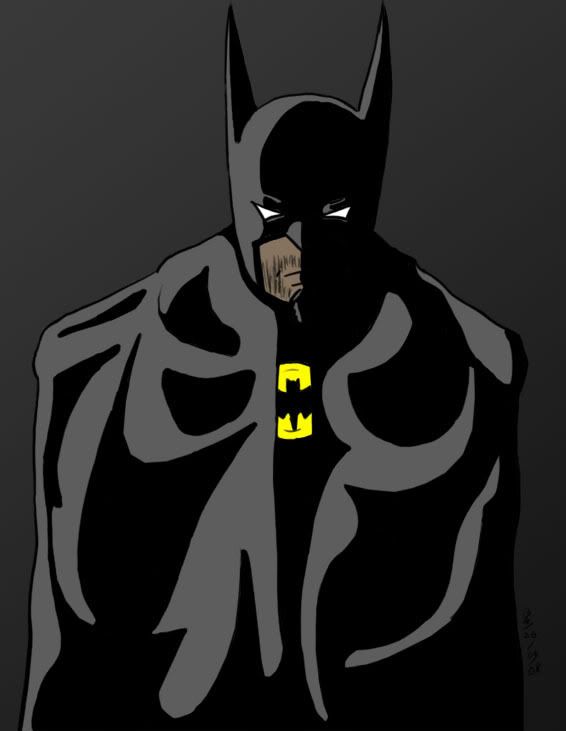
It's late and I'm going to bed, but I finished colouring this maybe five minutes ago and I want to show you all.  It's another shameless self-portrait, this time donning the Dark Knight's cloak and cowl in order to stalk the night and bring justice back to Gotham. But no, my parents are not dead. Also, it's my first time doing this kind of shading work, so please be gentle. :p
__________________
 Aye, num nums indeed.
|
|
|

|
|
|
#3656 |
|
Sent to the cornfield
|
That's not my cloak.
:p Good job, though. And to you too, ZJ. Edit:  This warrior, who I haven't chosen a name for, is huge. Really bulky and tall. He's an incredible warrior who smashes right through his foes' defenses with his great blade. He is also intelligent. He almost never takes off his full plate armor, though not by his choice. He is always a faceless war machine, dolling out death to the ones designated his enemies. But, as you may be able to tell from his eyes, he grows increasingly weary of battle. He wanted to do something with his life and now, growing old but still fit for battle, he wishes for nothing more than to settle down and perhaps become a farmer or an artist. His hair is beginning to grey under the death mask visage of his helmet, a fact which only increases his desire to give up his blade and retire. It makes him feel old, which is not necessarily a bad thing but makes him realize he never got to do any of the things he wanted to do in life... I just came up with that while drawing it, but its certainly a character I like and identify with, sans a few things. Edit:  That's supposed to be blood on the left if you can't tell. More of The Warrior, which I'm thinking is a fairly good name for him as he is almost always nothing but this faceless death machine. Very few people have even seen his face. As far as many know, there is nothing under that mask. No identity, no person. There is only The Warrrior. Last edited by TDK; 06-27-2008 at 02:37 PM. |
|
|

|
|
|
#3657 |
|
...Really?
Join Date: Jun 2007
Location: in Theory. Everything works here
Posts: 3,961


|
Low-brow humor+Starwars+no life+WAY to much time on one"s hands=
__________________
I have a Pesterchum its DangerousDoc I am ether fading out of Time, Space, or Reality...Or Simply my Typewriter is running out of ink |
|
|

|
|
|
#3658 |
|
Sent to the cornfield
|
 I think Dante could take Iron Man. Stark's feet and the right corner of Dante's coat bother me. |
|
|

|
|
|
#3659 |
|
So Dreamy
Join Date: Apr 2005
Location: Someplace magical
Posts: 6,863


|
Nice job with the forced perspective on Iron Man's hand. You're definitely improving.
I think I might have an idea why his feet and Dante's coat are bothering you, if you wouldn't mind me offering suggestions. Iron Man's foot is almost completely vertical there. His leg, however, looks like it's straight up and down. Your foot doesn't really bend that far. If his leg is straight up and down, you'd see a little of the top of his shoe, at the toe. If his leg is supposed to be stretched towards the "camera," then you'd see less of his shin because his foot is closer to the viewer. It might be his kneecap, too-- since his shin is not shaded or fixed with any defining lines, it's more difficult to tell the exact position of his leg. If his leg is straight up and down, then the top of his "boot" there on his kneecap would fall at the natural knee, where it is right now. If the foot is supposed to look like it's extended towards the viewer, it would be in a slightly different spot. Forced perspective like that is pretty tough; I have trouble with it too. Or maybe it's the shape of his foot that bugs you? He doesn't appear to have arches right now: Both sides of his foot curve at the same angle. The inner edge of the foot would curve inward, at the arch, and the outer edge of the foot would be straighter and would NOT curve in. As for Dante's coat, there's a couple of things you could do. The easiest fix would be to extend the edge of Dante's raised foot to extend beyond the edge of the coat, even if only by a tiny bit. Then it establishes the position of his foot in relation to the coat. Also, the curve of that fold is in the exact position of the rest of the coat's edge. That suggests that the corner that folds back is actually longer then the rest of the coat. If you cut back that edge just a little, maybe make it a concave instead of a convex edge, it'll look a bit more... "right," maybe. Would you mind if I illustrated what I'm talking about? I'm not so great explaining these things in words, so I did a quick doodle in Paint over your drawing. Is this helpful at all? The foot I drew isn't on the right angle, now that I look at it (it should probably tilt further to the left), but does it help illustrate what I'm talking about with the top of the shoe?  One last minor thing. I think one of the problems might be that Iron Man's shoulders and hips aren't on a parallel line with one another. His shoulders are slanted, showing that he's turned slightly on the z axis and is flying backwards. His hips, however, are on a perfect horizontal line. If he was standing straight on the ground, that'd be great. But since his torso is turned slightly, his hips should probably follow that same angle. Then his far foot would be a bit higher up than his closer foot, further accentuating the fact that he's turned on the z axis and helping create perspective.
__________________
Yoo Hoo! |
|
|

|
|
|
#3660 |
|
Sent to the cornfield
|
Heh, thanks Mauve that was really in-depth...
I mean, I knew why the feet and coat bothered me, though. The former I just kind of gave up on because I'd been working on it for a while and would have to erase it all to fix it. The latter was too rounded and such. I'm just too lazy to go back and fix it, because I didn't notice until after I scanned it.  I see what you mean with the hips, though. Thanks for the help! |
|
|

|
 |
| Thread Tools | |
| Display Modes | |
|
|