
 |

|
|
|
#3921 |
|
Please Be Well
Join Date: Jan 2005
Location: Virginia
Posts: 2,715


|
So I just posted this in the Comic thread, but I wanted to post the pencils and inks as well and this seems more the place to do it. Plus, I haven't added anything here in a very long time.
Pencils (non-photo blue pencil)  Inks (Pentel Pocket brush pen)  Colors (Photoshop CS) 
__________________
|
|
|

|
|
|
#3922 |
|
Doesn't care anymore
Join Date: Mar 2004
Posts: 2,429


|
Colors are coming off as really flat in that last one Rick. I'd suggest going with a stronger harder edged brush instead of more of a soft light gradient. Makes it look less plasticy that way.
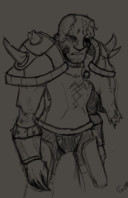
That and more emphesis on directional lighting. The shading is all over the place. ~~~~ People aren't letting me be a lazyass anymore, they're demanding I get to work on the undead warrior again. So here's the latest bit of progress over the earlier version. More kinks to be worked out as progress trudges on. 
Last edited by Grandmaster_Skweeb; 01-05-2009 at 08:40 AM. |
|
|

|
|
|
#3923 | ||
|
Please Be Well
Join Date: Jan 2005
Location: Virginia
Posts: 2,715


|
Quote:
Quote:
__________________
|
||
|
|

|
|
|
#3924 |
|
DA-DA-DA-DAA DAA DAA DA DA-DAAAAAA!
|
Corel - Very neat. Drawing on the facebook graffiti is pretty hard, since there's no layers and such. Yours look nice though. And yay for mouse drawings!
TDk - (and Corel too)I'm not sure if there's an actual term, but it's just because he's staring straight ahead. Even when you change direction of how you're looking at it, since the lighting and such doesn't change on a picture as it would in real life as you move, your brain tends to supply the information of "it's looking at me". It's the same reason that a picture of someone who isn't looking straight ahead will never look like they're looking right at you, even if technically you should be standing at an angle for it to happen for the picture. Yay art and psychology, two of my favorite subjects. Anyway, nerdy stuff aside, Mario looks pretty good. The shading on the colored one kind of throws me off, as it kind of moreso looks like there is something big in front of him (like a pillar or something) that is casting that very sudden, linear-ish shadow on him. Randomly I want to compliment you on the proportions of the face, as they look very good, especially the eyes. His head is almost exactly five eyes wide, with the spaces being right. I don't know if you conciously did that or not, but I still wanted to point out a good job. (wow that was long) RickZarber - I think that might be one of the problems that Skweeb is addressing with the shades not being dark enough, because as I look at the face to judge where the shadows should fall, there's hardly enough difference in the color of the shaded portions and the not-shaded portions to be able to tell if it's right or not anyway. When I took the picture into photoshop and just messed with the levels to make more of a dramatic difference, it looks like you've got the placement of the shades and such pretty good (a little splotchy and unsure in some places it seems), but with how little of a difference there is between the darks and the lights of the picture, the viewer can hardly see your shading at all. As my art teacher in high school always drilled into my brain "Make your darks darker, and your lights lighter." You might find yourself pleasently surprised, even if it's not exactly what you originally intended. Very nice work though. I really like the lineart. I am envious of those hands. Skweeb - Great as always. I love the detail in the shoulder armor. The chips in the spikes. So awesome. How long have you been drawing these kind of drawings? Just out of curiousity. And geeze, since when did I get so long winded? Hopefully it was helpful though. First drawing of 2009. I'm hoping to color it with these new copic markers I got, but I'm kind of afraid of screwing it up.... Oh well, I guess that's why I got a picture of it.  Argh, and tiny pic scaled it down way farther than what I wanted but it works I suppose. And just to beat anyone to the punch, I know her one hand looks painful. her head and arms bug me too, but... it's already inked so I'll just have to live with it. Spent forever on the dang staircase though, I'm pleased with that. And her pants and shoes. Used a reference for the pose. Oh yeah, it's my character from Rock Band 2, Zeppelin. I just had to try and draw her. XD
__________________
 |
|
|

|
|
|
#3925 |
|
Sent to the cornfield
|
Awesome as always, CJ.
Thanks for the compliment on the proportions, I didn't conscious measure out the eyes, but I did concentrate on making it well proportioned. And the shadow thing, I dunno, I was trying it out. It WAS meant to look like something big was in front of him. |
|
|

|
|
|
#3926 |
|
I'm somebody else these days.
Join Date: Aug 2006
Location: Same house same hill same bat channel still canada
Posts: 1,968

|
The penciled version's mustache makes me think of Stalin. Mario scares me to no end now. You have accomplished something dangerous TDK.
__________________
"Life is like a box of chocolates. Cheap, thoughtless, perfunctory gift that nobody ever asks for." - CGB Spender
Super Perfundo on the Early Eve of Your Day. |
|
|

|
|
|
#3927 |
|
I'm somebody else these days.
Join Date: Aug 2006
Location: Same house same hill same bat channel still canada
Posts: 1,968

|
Sorry for double post, but this one has a picture!
Because slightly anthropomorphic polar bears with glowing ice swords? Utterly unnecessary! But fun to draw. This was after TDK told me bears have opposable thumbs.
__________________
"Life is like a box of chocolates. Cheap, thoughtless, perfunctory gift that nobody ever asks for." - CGB Spender
Super Perfundo on the Early Eve of Your Day. |
|
|

|
|
|
#3928 |
|
Sent to the cornfield
|
...Holy shit.
Edit: Got a couple pictures I did today I think turned out pretty good. I think this is the most ferocious bear I've ever drawn:  And this one is just madness:  I drew the tomahawk on his belt so it would be clear: He's CHOOSING to assault a bear with naught but his fists. That's just how he rolls. Because he is a badass. In the full page, I sketched out a little background, which included a cliff off to the right in the foreground. I'm thinking, this bear was standing there, or maybe they were fighting before, but either way this guy just tackled a bear off a cliff and started grabbing it in midair and beating the shit out of it. Last edited by TDK; 01-08-2009 at 06:51 PM. |
|
|

|
|
|
#3929 |
|
I'm somebody else these days.
Join Date: Aug 2006
Location: Same house same hill same bat channel still canada
Posts: 1,968

|
Hogads, that's quite good foreshortening you did on that first picture. And the second one I really can't say anything against except that there's a fair bit of eraser smudge that could use cleaning (if it isn't that kind of impossible-to-remove-forever smudge), and the cliff hasn't been added in this version.
__________________
"Life is like a box of chocolates. Cheap, thoughtless, perfunctory gift that nobody ever asks for." - CGB Spender
Super Perfundo on the Early Eve of Your Day. |
|
|

|
|
|
#3930 | |
|
Wat
Join Date: Nov 2005
Location: Amongst the dead
Posts: 2,716


|
Quote:
God i wish my dogs had opposable thumbs sometimes. |
|
|
|

|
 |
| Thread Tools | |
| Display Modes | |
|
|