
 |

|
|
|
#4351 | ||
|
Making it happen.
|
Quote:
__________________
Quote:
3DS Friend Code: 4441-8226-8387  |
||
|
|

|
|
|
#4352 |
|
Like a millionaire
|
Excellent art all around, dudes. Doc, I just want to say that I approve, full on two thumbs up, of your rendition of the Top Hat Assassin. That monocle is something I've never considered but heartily approve of. And is that a soul-patch kind of thing? 'Cause I'm totally rockin' one of those right now!
 Not the 'stache though, sadly... Not the 'stache though, sadly...Really though, that just blew my mind when I first saw it. Then I went Right Click > Save As. I just... FUKKEN SWEEEEEET If I may say just a tiny something? I designed him to carry a LOT of guns/explosives/ammo/assorted weaponry under that coat. And possibly even the hat. Just sayin'. :p Keep rockin' the pencil! Can't wait to see the finished versions of everyone.
__________________
 Aye, num nums indeed.
|
|
|

|
|
|
#4353 | |
|
Blue Psychic, Programmer
Join Date: Feb 2007
Location: Home!
Posts: 8,814


|
So that palette test? This is the palette I used for it. I affectionately call it "CGA PLUS" because of its heavy base in the ideas behind CGA.
 Basically, it's based on RGBI, with most of the palette centered around normal and halved RGB values, with halved intensity for a few of the grays. This is the palette I WISH I had done it in:  This is the result of me being anal and running the gamut of halved intensity bits, as well, since I already had for the grays. It's an 81-color palette with 8 duplicates due to the math involved, reducing it to an effective 73 colors. Naturally, I call it CGA++. Although looking now at the full EGA palette, it might just be easier to work with that (64 colors, fewer grays, but truer colors). Then again, I'm relying pretty heavily on those grays...
__________________
Quote:
Journal | Twitter | FF Wiki (Talk) | Projects | Site |
|
|
|

|
|
|
#4354 |
|
DA-DA-DA-DAA DAA DAA DA DA-DAAAAAA!
|
Doc Ock - I highly approve of being visualized as The Boss.
Queen - Aah that's cool, and freaky! Kyanbu - those weapons are pretty cool looking! In celebration of Big Shell Day (yesterday) here's raiden.  His barcode tattoos ran off with his nipples somewhere. I'm still looking.
__________________
 |
|
|

|
|
|
#4355 |
|
...Really?
Join Date: Jun 2007
Location: in Theory. Everything works here
Posts: 3,961


|
Finally I got a version of Kyan that I like...I made Kyanbu the Experienced one for some reason I think because When i think Legend I think Old. So Kyan If you if you don't like this I can switch to a younger version in a snap.
also i was playing around with scraped story ideas. so yeah You can see some alts to THA's mask and some of his Gentlemen assassins. Along with the Gentle-scientist assassins. What! I have to out crazy Brian somehow! also changed IQ's glasses to fit her Deadpan personality
__________________
I have a Pesterchum its DangerousDoc I am ether fading out of Time, Space, or Reality...Or Simply my Typewriter is running out of ink Last edited by Doc ock rokc; 05-03-2010 at 09:45 PM. |
|
|

|
|
|
#4356 |
|
Doesn't care anymore
Join Date: Mar 2004
Posts: 2,429


|
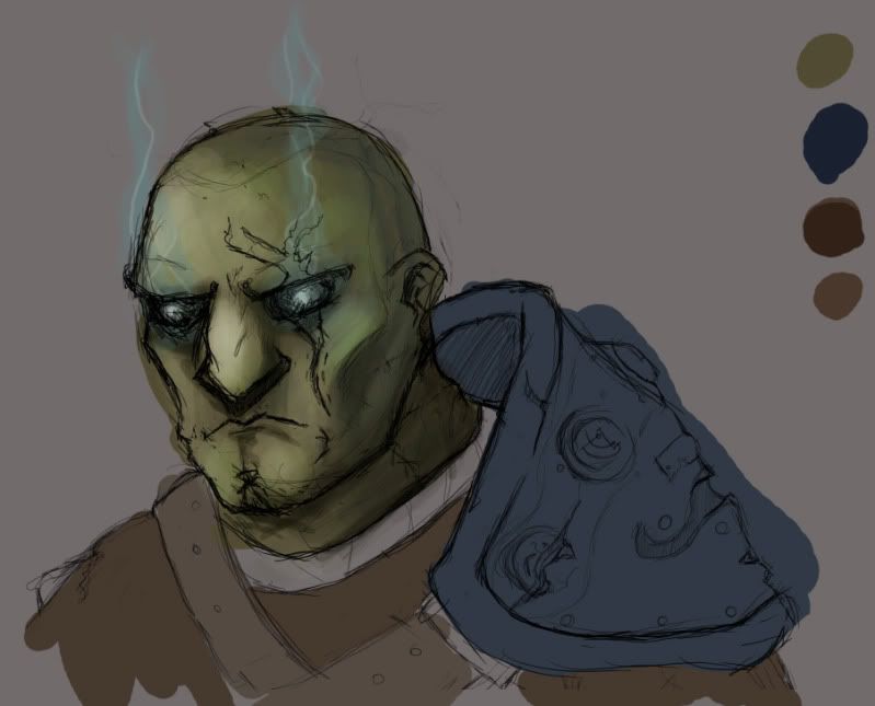
Been gettin too damn rusty for my own good. Dusted off the ol' wacom and threw together a quicky. I like how this is turning out so I'll likely work on it more.
Edit: Moar has been done. 
Last edited by Grandmaster_Skweeb; 05-04-2010 at 04:18 AM. |
|
|

|
|
|
#4357 | |
|
Local Rookie Indie Dev
|
Quote:
back in 2007 around the time I first created Sarina. There was this sig I was trying to make but It didn't turn out the way I wanted it to. almost 4 years later yesterday. I decided to give it another go. Here's the stock image for said sig. Crimson Assassin Wallpaper stock WIP Flat color stage. Next is for me to decide on a background for it before rendering it. Queen of the night Silvia Phantom Line work. Note that this is almost a month old. I simply just forgot about it.
__________________

Last edited by Kyanbu The Legend; 05-04-2010 at 11:12 PM. |
|
|
|

|
|
|
#4358 | |
|
Blue Psychic, Programmer
Join Date: Feb 2007
Location: Home!
Posts: 8,814


|
 So yeah, decided to add a bit more depth to gameplay. Cursors on the top are the main versions, the couple underneath are alts just saved for reference. To break it down: - added an injured face sprite - added another cursor type for stealth knockouts (basically a backstab) - decided to take it into the 3rd person and put a Feng sprite 2 tiles away from the camera, leaving an open space behind him. The reason for this is because he's got powerful enough senses to know what's back there. - added a new bit to the interface that shows how much he stands out in a crowd during daytime portions. If he becomes too suspicious, he gets caught when someone sees him do something or be somewhere he shouldn't be as a corollary to visibility during stealth bits. - I realize he's quite small in comparison to the viewscreen. Part of this is perspective and part of it is because things are built bigger to accommodate a race of larger people. In the world he's in now, people start out the same size as humans and just grow for more years, so they range to about half again as tall as humans or so, and everything is likewise built to that standard.
__________________
Quote:
Journal | Twitter | FF Wiki (Talk) | Projects | Site Last edited by bluestarultor; 05-10-2010 at 12:48 PM. Reason: typo |
|
|
|

|
|
|
#4359 |
|
Local Rookie Indie Dev
|
Looks good so far Bluestarultor.
D-Universe Wallpaper 1 Click to view
__________________

Last edited by Kyanbu The Legend; 05-10-2010 at 08:50 PM. |
|
|

|
|
|
#4360 |
|
Just sleeping
|
Such an immodest pose...
 This smilie is awesome I'm in love.
__________________
Be T-Rexcellent to each other, tako.
 |
|
|

|
 |
|
|