
 |

|
|
|
#11 | |
|
Blue Psychic, Programmer
Join Date: Feb 2007
Location: Home!
Posts: 8,814


|
That's a great sketch, CJ! Looks like it would be really easy to clean up and color.
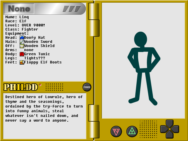
 And Matt, that's just awesome. XD Edit: Here's a mock-up of what the character sheet may look like. I decided to use a pale gray to put text on instead of the blinding white I had before.  I also changed the None banner to look more like it was a part of the top bar, so the window looked like it didn't have anything stuck in it. Also also, I know how I'm going to do my character blocking when I finally get around to doing the avatars. Edit again: Here's a newer mock-up:  It's incredibly messy, sadly. I was using this as a full-on test to make sure everything would fit, and, well, with the ability to wear five rings per hand, it potentially means the last possible slot could get pushed onto the lower screen. Thankfully, tail slots are only used by a specific race that's not a part of the main roster. That's disregarding the possibility of listing ammo equipped to ranged weaponry, but I'll figure it out. The pictures at the bottom are my solution to not having everything on the interface. They're used for the menu, setting up a shop, proposing a duel, giving you a list of all people currently on the screen (it'll be easier than trying to make the player click those tiny markers), interacting with the environment (pick up nearby items, flip switches, etc.), clearing out the buttons to post a short message (local shout, team chat, etc.), and an example of one of a few different buttons expressing different races' abilities to identify important objects or otherwise gather information. The top bar now serves as a sort of "info at a glance" thing, with the character's elemental focus (this is a separate bonus from their innate element), their token (to identify innate element and race), a class token (I did my best to make the icons all self-explanatory and they're further color-coded to identify whether they're a physical, magical, item-based [such as an Engineer], or ability-based class [such as a Thief] class), and user type. If there's anything I learned from Gaia, it's that people are gullible when it comes to identifying people posing as staff, so it's listed there first thing. The original idea was to prefix it to every name, like I have there, but it's ugly and insulting and I think having the chip is just a better idea.
__________________
Quote:
Journal | Twitter | FF Wiki (Talk) | Projects | Site Last edited by bluestarultor; 06-09-2010 at 07:22 PM. |
|
|
|

|
|
|