
 |

|
|
|
#11 | |
|
Blue Psychic, Programmer
Join Date: Feb 2007
Location: Home!
Posts: 8,814


|
Alright. Here are skins I know I'll be using:
Ruby: 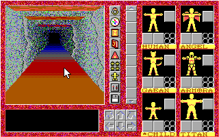 Sapphire: 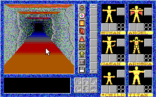 Emerald or Jade: 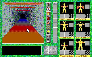 or or 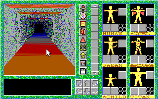 Minimalist: 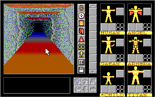 These are ones I'm less sure about: Amber (would likely be the 4th game): 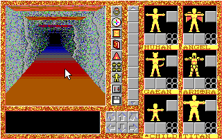 Topaz: 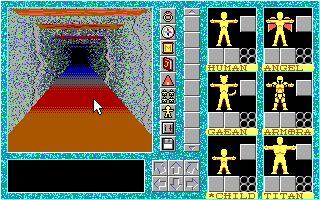 Amethyst/Tourmaline/Something:  Turquoise:  The question is which of the two greens is better and what to do with the extras, as per the question in my previous post. Edit: While I'm at it, worked some on PoC's interface.  I needed a way to display party stats, so the way it goes is by color coding. Since only four party members are in combat at once maximum, I devoted the first four doubled bars to showing their HP and MP. The last set of bars is the HP of the remaining two members. Jet is gold, Glenn is green, Cy is cyan, Medea is black, Garrott is red, Norman is pink, and Ben and Tiger are teal. (For those of you wondering, yes, that leaves one character unaccounted for. Norman ends up not fighting by the time this would be an issue.) Also, I needed a way to streamline puzzle-solving using commands. Hence putting the orbs up at the top there. The command setup screen will allow the player to not only build pre-defined battle commands to choose from, but will also let you choose five command orbs to have at the ready in the field, plus the GO orb to execute. That's not enough slots to cover all of them, but with a bit of good design, it will hopefully be enough to get the player through an area without having to constantly go back into the menu. All command orbs have an icon inside them, and if visibility is an issue, activating an orb by clicking makes the orb light up to show it better, as shown with the OPEN command. I've done my best to make the icons self-apparent, but the command menu will have a place that lists the name, so it's not totally pictoral. I realize it's a bit cluttered now, but I needed something to fill some space, which is where putting the HP bars there came from, and those have honestly been there for a while. I may end up making it so the center button on the pad actually executed the commands instead of opening up the menu, which is honestly what the original plan was, thinking back to before I was doing this 8x8. I'll probably make it the execute button again and free up the sixth slot for another command orb. The command setup menu can go as a subset of Jet's page, I guess.
__________________
Quote:
Journal | Twitter | FF Wiki (Talk) | Projects | Site Last edited by bluestarultor; 07-26-2010 at 05:21 PM. |
|
|
|

|
|
|