

 |

|
|
|
#3431 |
|
Sent to the cornfield
|
Sketchpad number one.
Which style of wings do you guys like best, out of the angelic ones there and the others I have used previously? |
|
|

|
|
|
#3432 |
|
I'm somebody else these days.
Join Date: Aug 2006
Location: Same house same hill same bat channel still canada
Posts: 1,968

|
Though they probably show up well on your pc's screen, my laptop isn't displaying a lot of the details in that image for some reason. (Might have to do with flatscreen versus regular variety) The one angel shouting "RAWR" is nice and sharp though.
__________________
"Life is like a box of chocolates. Cheap, thoughtless, perfunctory gift that nobody ever asks for." - CGB Spender
Super Perfundo on the Early Eve of Your Day. |
|
|

|
|
|
#3433 |
|
Sent to the cornfield
|
Well, I have a flatscreen and they still show up, albeit lightly. I didn't go over most of it again with my pencil before scanning, as I do for drawings I mean to color. These are just some sketches, for practice, that I decided to post. I also scanned it in grayscale, so the shading would show up, as opposed to my normal black and white.
I could open photoshop and darken it a bit for ya. That is the sketch I told you about last night, Khael, the angel chick saying rawr. Edit: Here ya go. Last edited by TDK; 03-02-2008 at 06:36 PM. |
|
|

|
|
|
#3434 |
|
I'm somebody else these days.
Join Date: Aug 2006
Location: Same house same hill same bat channel still canada
Posts: 1,968

|
Ahh, now I can see it wonderfully!
The wings actually on your angel there are great, as is the lowest feathery one on it's own. The other feathere'd ones are pretty good too, it's just that the two I mentioned in particular look more suited to flying. (I tend to be a bit realism-oriented as far as functionality, so that's my bias for ya.) The bat-winged/not feathered ones look like the joints are in a funny spot (bat wings are basically arms with really long, webbed fingers), but they have some neat details that you should hang onto if you change them at all in design. That black one at the bottom I thought looked cool.
__________________
"Life is like a box of chocolates. Cheap, thoughtless, perfunctory gift that nobody ever asks for." - CGB Spender
Super Perfundo on the Early Eve of Your Day. |
|
|

|
|
|
#3435 |
|
Like a millionaire
|
The very top wing and the third from the top look rather nice, I think they'd make for the best angel wings, more or less. That claw one looks pretty sweet too, even though it's not necessarily something an angel would have. :p
Really, all I can think of suggesting (and it's not even that necessary, really) but try shaping the wings more into a Z. Really, you've already got that in a sense, just maybe pronounce it a bit more. Otherwise, nicely done.
__________________
 Aye, num nums indeed.
|
|
|

|
|
|
#3436 |
|
Yeeeah, son.
|
Some Salvador Dali-inspired goodness! This picture is quite old, but it still remains as one of my favorite drawings I've ever done (which is why there are some tears which can be noted at the edges).
 Khael!: That is... Interesting. Although I do have one question: how is he holding that? The lack of opposable thumbs makes it a tad difficult.
__________________
The artist formerly known as 'ZutsuJin'. "It is not necessary for the public to know whether I am joking or whether I am serious, just as it is not necessary for me to know it myself"
|
|
|

|
|
|
#3437 |
|
I'm somebody else these days.
Join Date: Aug 2006
Location: Same house same hill same bat channel still canada
Posts: 1,968

|
I couldn't figure it out either, the idea of adding the burger was a sudden and unplanned thing. Damnit, I realize I just talked about leaning towards realism for functionality, but it seems I break my own rules. Now I'm an angry hypocrite! Ack! Maybe he's pushing it up against his giant belly... no, I know damned well the angle doesn't look that way...
I'm more bothered by the aspect that it's a pig eating cow. I mean, you could feed one a burger I suppose, but a pig actually going and eating a cow in nature is ... well it would be really freaky to see. Frig Savage, I envy your art. I wan to draw things with crisp edges and full of style.
__________________
"Life is like a box of chocolates. Cheap, thoughtless, perfunctory gift that nobody ever asks for." - CGB Spender
Super Perfundo on the Early Eve of Your Day. Last edited by Khael!; 03-03-2008 at 02:02 PM. |
|
|

|
|
|
#3438 |
|
Sent to the cornfield
|
|
|
|

|
|
|
#3439 |
|
This is not my face.
|
Concept/Design sketches for a project I've been developing for a while. All artwork �Ryan Cole 2008.
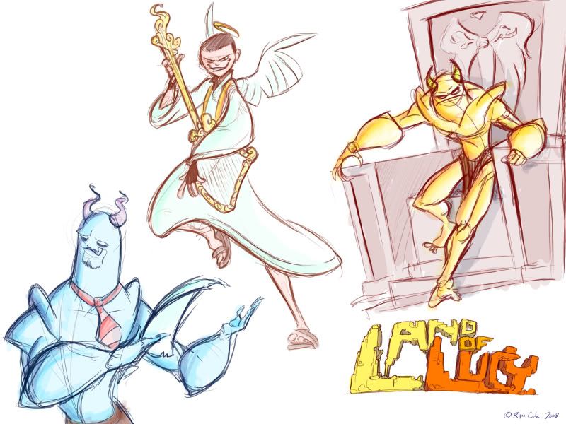 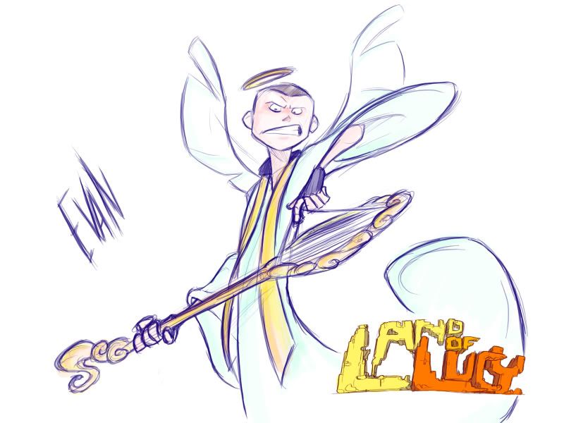 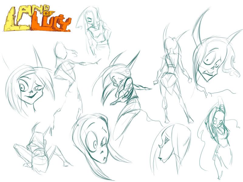 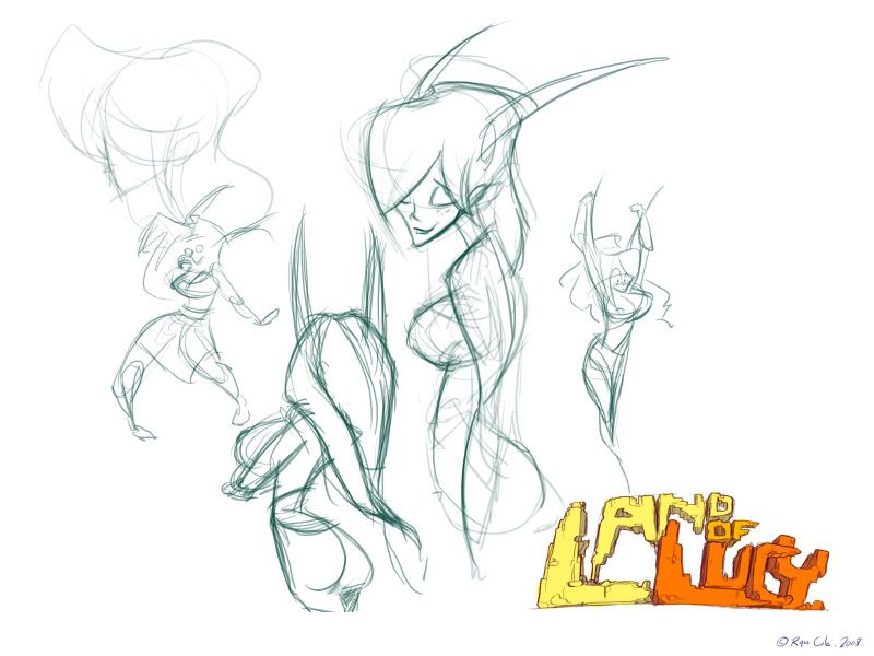 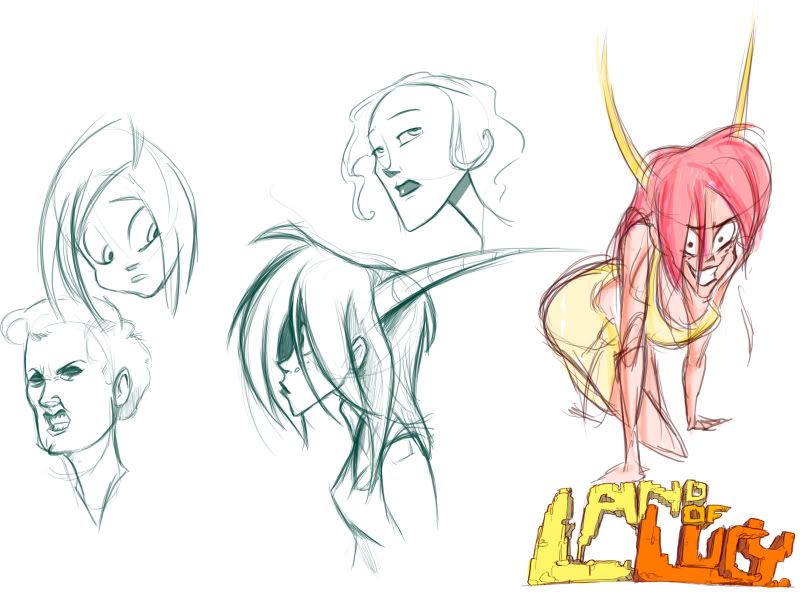 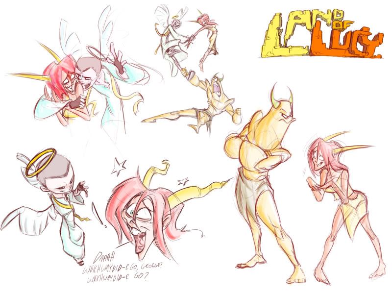
|
|
|

|
|
|
#3440 |
|
DA-DA-DA-DAA DAA DAA DA DA-DAAAAAA!
|
Savage Thinking - Holy crap that's awesome. I can't help but love the guy with his neck around the tree. That is awesome. I love the style.
TDK - Looking better. Especially the wings. Nice improvement. Fisi Visi - Those are sweet. I quite like the character designs and I am intregued as to what they're for. =D Also, I took FANTASTIC notes in class today:  I originally just started drawing the eyes, and the rest just came from that.
__________________
 |
|
|

|
 |
| Thread Tools | |
| Display Modes | |
|
|