
 |

|
|
|
#3891 | |
|
Sent to the cornfield
|
Quote:
As for cleaning up methods, I'm pretty sure most of us use photoshop (or something similar. I used photoshop 9 until recently, and now CS2.), and I, along with a few others I think, use the pen tool in said shop of photos, to redo and clean up the lines. Like, New Layer, trace over all the lines with the pen tool (its very easy to fix mistakes and stuff with this method, too), right click, stroke. Doing so with the brush makes the lines much better, and with the pencil it makes them better than the lines would otherwise have been, though still...messy. It takes a lot longer than other methods, but its worth it in my opinion. (If you need help "legally" acquiring photoshop, send me a PM.  ) )And medium-wise, I do most of my drawings on plain white computer paper, and at school on my drawing pad (watercolor paper, its rather thick and not too good for pencil, smudges it a lot, but I like the way its made, easy to flip through the pages and they don't tear. Plus its got a lot of pages.), though I make (or rather made, before I started using this outlining method) a point to do drawings I plan to color on plain paper. Edit: On Khael's suggestion: 
|
|
|
|

|
|
|
#3892 |
|
DA-DA-DA-DAA DAA DAA DA DA-DAAAAAA!
|
Wow, it's been awhile. Random comments as I feel like doing!
TDK - I love the concept, made even more hardcoooorez with the chainsaw. Awesome. Arhra - I used Photoshop personally. If you want to know how to do lineart on photoshop, I would recommend finding some good tutorials. If you don't know where to look, I think I can reccommend some for you if you want. As for your inspiration question (that might actually make a cool thread for the arts and crafts forums, to discuss inspiration and such), I usually just get inspired by day-to-day things, just random thoughts that occur to me or something that spurs an idea. Fortune Zero - Very nice, but I have to agree that the belts don't look like belts without buckles. And I would add some varying thicknesses to the belts, since belts aren't super-thin. Khael - I quite like the color of the creature thing. The teeth freak me out a bit though! Incredibeefy! Corel - I quite like your facebook painting things. Quite nice work! Do you ever draw on anything other than that? Alright, that's three pages back... What I've been working on:  Closer Shot: (not very good quality because of holding it over the scanner)  (thumbnail'd for super-hugeness) http://tinypic.com/view.php?pic=11j17o5&s=4 <- link to above just in case, because imageshack has been being a punk lately. Future art student hopefuls: this is what you have to look forward to. I just spent... about two hours on this picture and I accomplished... a very small portion. But I'm pleased with how it's going.
__________________
 Last edited by CelesJessa; 12-08-2008 at 12:48 AM. |
|
|

|
|
|
#3893 | |
|
Welcome, to Paedogeddon!
Join Date: Nov 2008
Posts: 1,015


|
Quote:
And you were not joking about the level of detail going into the above picture! |
|
|
|

|
|
|
#3894 |
|
Sent to the cornfield
|
Holy crap, CJ. o.o That's really detailed...Awesomeness!
I think this came out very well for no reference: Mighty Thor Slew a Bear  Though the Bear is silly and not realistic on purpose. :P What things do you guys think I need to work on the most in my drawings? Like which parts of people, which principles (like perspective), stuff like that. Last edited by TDK; 12-08-2008 at 04:32 PM. |
|
|

|
|
|
#3895 |
|
I'm somebody else these days.
Join Date: Aug 2006
Location: Same house same hill same bat channel still canada
Posts: 1,968

|
Well, perspective seemed the issue on the landscape one you did, but when it comes to landscape you pretty much have to use those stupid vanishing points. (I haven't been able to get such perspective guidelines to work for people nearly as well though.)
I'd say getting the feet to look right could use some work. They're a bit bulky and simplified in some pictures. Though since the focus of a picture tends to be everything else, it's a logical timesaver. Plus, they're kind of frustrating. Actually the biggest issue you have is one you've just explained. It's the smudgyness from that watercolour paper. But yeah, I like that paper too since it doesn't get wrecked from frequent trips in a backpack. I switched to 4h pencils partly because of that. YES you coloured the dragonslayer pic! Now it's awesome yeaahh! Chainsaw looks just a tiddlybit floaty, might just be the way his thumb isn't really wrapped around the handle. It would be mostly out of view if it was. Arhra: yeah, I steal good art programs only to turn around and draw things on lined paper. Whatever you got paint to do would be incredibly handy for sprite-like creations. Gimp is always good if you want smoother blending of colours without all the illegal. Though it isn't photoshop. CJ: Oh gods the muscles! they're... realistically meaty. It's kind of creeping me out. :P No but it's looking amazing. Heh, yeah, incredibeefy. Maybe I'll ditch the tusks on these guys and make them look less mean after all. Though... oh wait, rodents have teeth that grow constantly right? This Shaedys can just be special and not file those ones down on purpose. Solution yaay. And I am 100% stealing Blue's idea for how they talk. The advantage for the shaedys being (if it works out like I think it might) that they'll almost never have to worry about choking on their food.
__________________
"Life is like a box of chocolates. Cheap, thoughtless, perfunctory gift that nobody ever asks for." - CGB Spender
Super Perfundo on the Early Eve of Your Day. Last edited by Khael!; 12-11-2008 at 10:43 AM. |
|
|

|
|
|
#3896 |
|
DA-DA-DA-DAA DAA DAA DA DA-DAAAAAA!
|
TDK - What you need to work on? For comic-y drawings like what you do... Right now I would say focusing on how the body looks with different poses, foreshortening with the limbs and whatnot. I would also work on your non-human drawings, such as your bears and your dragons. To improve, I would actually suggest finding some already-drawn art work and trying to replicate it as close as possible. I know it sounds weird, as the (online) art community seems to have issues with people using other art as exact references, but it really helps to try your hand at how things SHOULD look. Also, I would work on making drawings that aren't so... "hatchy-scratchy" as my art teachers would put it. XD Like, make more uniform lines, because without them, it's kind of hard to tell what exactly is going on everywhere. For finished-linearts (like what you do on photoshop), I would work on using different line weights. They really help with making the lineart look good. And details, details, details make a regular picture great.
Anyway, was bored during class, so I drew. I've been really wanting to draw Mario-style for awhile and I think I did a pretty good job of emulating the style for once("good" as in, better than some of the terrifying attempts I've done lately). Also, I can't draw Bowser. XD  Question: Why are Toads dressed like Aladdin?
__________________
 Last edited by CelesJessa; 12-12-2008 at 08:36 AM. |
|
|

|
|
|
#3897 |
|
Sent to the cornfield
|
Thanks for the tips, CJ/Khael.
 I might do an on/off whenever-I-feel-like-it kind of comic, more of a world setting than an actual updated/plot thing. As a creative outlet, for the ideas I get involving a setup or a world, and as inspiration of things to draw. That said: 
|
|
|

|
|
|
#3898 |
|
DA-DA-DA-DAA DAA DAA DA DA-DAAAAAA!
|
I like that "Explode!" sound effect. XD The guy looks pretty good, although I would work on your one-point perspective for the buildings and roads.
Art project I finally finished in my foundations class (3-D art (sorry, I know this is the "sketches" thread but... I don't really want to make a whole new thread just for this)). It's now trapped behind a glass display case in the art building, so.. it was hard to get a picture of it. I'll have a better one later.  18x32 bass relief in wood, painted with guache. The assignment was to make a bass relief out of a preexisting piece of art. I did "Into the Lake" by Georgia O'Keefe.
__________________
 |
|
|

|
|
|
#3899 |
|
Ara ara!
|
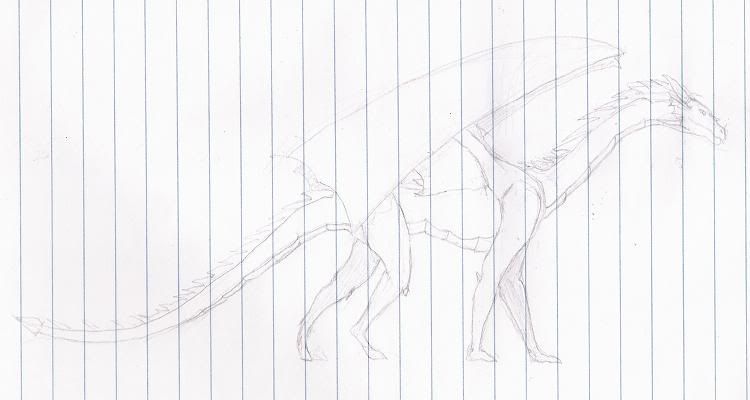
Oh, while I think about, I decided to try something other than basic human figures for a little while. I tried a dragon, as it has the advantage that since they're not real, it will cover for any anatomical errors I make, hurrah!

I find it looks like a lot like a horse to me.
__________________
This post is a good source of Ara ara, ufufu.* *These statements have not been evaluated by the Food and Drug Administration. This post is not intended to diagnose, treat, cure or prevent any disease. |
|
|

|
|
|
#3900 |
|
DA-DA-DA-DAA DAA DAA DA DA-DAAAAAA!
|
That looks pretty cool. I think maybe the back feet look a bit like hooves, which might be what is making you think it looks like a horse.
I am aaaallmoooost done with my final project  Yeah, I already know this one sucks pretty bad as far as the face. I have issues making profiles, especially realism. Now for the cool parts  
__________________
 |
|
|

|
 |
| Thread Tools | |
| Display Modes | |
|
|