
 |

|
|
|
#3991 |
|
...Really?
Join Date: Jun 2007
Location: in Theory. Everything works here
Posts: 3,961


|
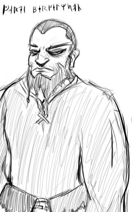
just fooling around with a new art style and this sprouted up...answering the first question i said to it...
WHAT THE HELL?
__________________
I have a Pesterchum its DangerousDoc I am ether fading out of Time, Space, or Reality...Or Simply my Typewriter is running out of ink |
|
|

|
|
|
#3992 | |
|
Blue Psychic, Programmer
Join Date: Feb 2007
Location: Home!
Posts: 8,814


|
Well, TDK, a picture is worth 1000 words:
 To explain, most of your skeleton is just fine, but the far arm should be shorter because of distance. The length would indicate it's just as close as the front arm which just isn't true. The hands need work, but I'm not going to pick on you for that.  As for musculature, adding the bulge to the upper calves brings back proper anatomy and adds a more graceful form to the figure. I also tried to crudely draw a circle where the ankle needs to bulge out a bit, but I'm honestly not happy with it. Still, it should give you at least an idea that you need to fix that pinch. Really, it should be more of a curve than a bulge, but I did it sort of as a half-skeleton joint. I'm really not up on art syntax, so I don't know if that's really proper or not. CJ can tell you.
__________________
Quote:
Journal | Twitter | FF Wiki (Talk) | Projects | Site |
|
|
|

|
|
|
#3993 |
|
Yeeeah, son.
|

__________________
The artist formerly known as 'ZutsuJin'. "It is not necessary for the public to know whether I am joking or whether I am serious, just as it is not necessary for me to know it myself"
Last edited by Savage Thinking; 02-28-2009 at 03:26 AM. Reason: Fixed a silly mistake. |
|
|

|
|
|
#3994 |
|
Ara ara!
|
I am not sure what that is, but it terrifies me on an existential level.
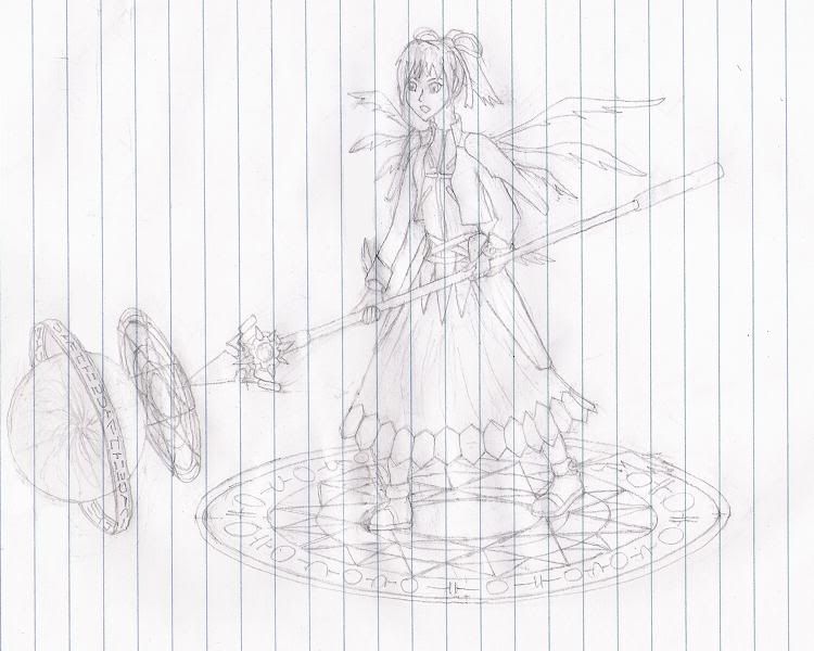
Woo, I finally have drawn something to put up. Because of my lack of imagination in thinking up things to draw, I settled on a character from an RP I'm currently running on the forums. You may notice they are rather blatantly some kind of magical girl.  It looks a bit stiff, but its not bad for my first try at a dynamic pose I think. Couldn't get the position of the right foot to look natural and how the dress falls is messed up too as a result. Head's a bit too far left too and the spear's not quite right I think. I haven't done much perspective work so far. I think I'm going to have to use some better quality paper for my next serious attempt at something.
__________________
This post is a good source of Ara ara, ufufu.* *These statements have not been evaluated by the Food and Drug Administration. This post is not intended to diagnose, treat, cure or prevent any disease. |
|
|

|
|
|
#3995 |
|
DA-DA-DA-DAA DAA DAA DA DA-DAAAAAA!
|
Grr dang firefox closin' on me while writing a long comment.
Skweeb - I really like that picture for some reason. It looks so different from your other work, yet I can still tell it's yours. I really like the glove thing he has. TDK (and bluestar) - I... I'm not sure what the circle in her pelvic area is supposed to be representing. If anything that circle and the one in the torso area should be similar in size, as humans aren't cone-shaped. And the circle for the shoulder(s?) seems to imply that both arms should be coming from the same place, which, unless you're very rigidly posed, I don't think your shoulders would be a straight line across. I"m not sure you need to make the back of the leg bulge thing (the gastrocnemious tendon maybe? I'm not sure) as pronounced or big as Blue made it (unless you want some hercules legs) but there definately should be something hinting at a musculatory system under the skin (the human body should probably never have a completely straight line in it.) Hint: Make the pose yourself in front of a mirror or get a friend or family member to make the pose and see how their limbs/body move and bend.  But honestly, I think you're making progress as the torso and such is actually not too bad. Question: did you make the hair like that for the picture, or so that you don't have to draw the face because it has a definate "Let's put this here so I don't have to draw the face" vibe to it. Actually the thing that bugs me the most really is just the right arm. Trying to mimic the pose the hand is either on backwards, or in a strange position(as I'm not sure why her palm would be facing out in that particular pose.) But anyway, Good job! Keep up the practice. (And just for reference, I am not the end-all to anatomical/drawing knowlege. I just try to give advice.  ) )Savage Thinking - What is with the scary pictures again. :gonk: But really, very cool. Your style would lend well to printing(like with wood and ink and such). Have you ever tried it? Arhra - Nice. It has a very cardcaptor feel to it. The biggest issues I would say are her limbs seem way too skinny, and her neck is super long. That magical ball-thing, whatever she is doing is really fantastic though. I keep staring at it. Ummm I've been drawing stuff or something I dunno. SUPER HUGE DRAWING UPDATE. Found a new online drawing program thing Tegaki and I have been playing with it. YAY FOR NO LAYERS:    (I apparently have to draw a pheonix eye every time I get used to a new program. I dunno why.) Less interesting pictures from the program   And usual Photoshoppery:  I HAVE BEEN DRAWING WAY TOO MUCH.
__________________
 |
|
|

|
|
|
#3996 | |||
|
Yeeeah, son.
|
Well Arhra, CJ pretty much covered everything, but giving her some slighter bigger hands would help. Oh, and I can tell that right foot was a bitch, so just making it longer would help, or maybe have it face the viewer or something. The left foot is pretty sweet though (so jealous).
Quote:
For that first picture: I like it, but her eye should be tilted downwards more to match the other. Oh, and her left eye looks like it needs some Clear Eyes. Did you use the mouse to shade that? Because that would be amazing. On the second one: And you thought mine were scary.. >.> Third one: Very awesome, except the black thing that connects the head to the beak (excuse my total ignorance of bird anatomy), the highlight should be better defined. Or atleast throwing in some white (instead of just grey) would help it a lot. MGS One: I really like the shadowing on the clothes and hair. But the shadowing on the skin seems too dark. Unless they have a light shining right on them, then maybe that lighter skin color should be darkened some more. For the profile shot of the Boss, making her face shorter would help a lot. And I didn't know there were MP3 players back then. >.> Quote:
 Quote:

__________________
The artist formerly known as 'ZutsuJin'. "It is not necessary for the public to know whether I am joking or whether I am serious, just as it is not necessary for me to know it myself"
|
|||
|
|

|
|
|
#3997 |
|
DA-DA-DA-DAA DAA DAA DA DA-DAAAAAA!
|
I did everything up there with the mouse. Actually I do everything always with a mouse because I don't have a tablet that works. (unless it's obviously traditionally drawn.)
__________________
 |
|
|

|
|
|
#3998 | |
|
Blue Psychic, Programmer
Join Date: Feb 2007
Location: Home!
Posts: 8,814


|
Aww! ST! I only said CJ because she's a traditional art student whom I figured would be all up on blocking syntax. All I really know is that it's something like lines for bones and circles for joints, but not really how it's supposed to be executed, which is why I just throw circles around whenever it's useful to follow the lines of what's there, as evidenced by my shoddy representation of things like shoulders, ribcages, and pelvi(?). I do have a pretty decent knowledge of what makes for a good skeleton, at least in my opinion, but as CJ said, I might not be all up on what makes for realistic musculature. I just sort of followed the lines TDK already had there, which admittedly makes for some big legs, but it was easier to do that than to redraw frankly a lot more of it. My aim isn't so much to "correct art" as it is to "give an idea."

__________________
Quote:
Journal | Twitter | FF Wiki (Talk) | Projects | Site |
|
|
|

|
|
|
#3999 | |
|
DA-DA-DA-DAA DAA DAA DA DA-DAAAAAA!
|
Quote:
__________________
 |
|
|
|

|
|
|
#4000 |
|
Doesn't care anymore
Join Date: Mar 2004
Posts: 2,429


|
 Yup. I'm under a barrage of get back to doodling! So doodling I am. Nothing special here..just a quicky doodle chock full of mistakes. Boy howdy! |
|
|

|
 |
| Thread Tools | |
| Display Modes | |
|
|