
 |

|
|
|
#4361 |
|
Local Rookie Indie Dev
|
Queen of the Night 2010
__________________

|
|
|

|
|
|
#4362 | |
|
Blue Psychic, Programmer
Join Date: Feb 2007
Location: Home!
Posts: 8,814


|
So I had an awesome dream last night about a game that I now have notes for. Occasionally I'll do that, just literally have a dream about grade A material.
Anyway, this is one of the characters, the healer:  The shaded parts of the outfit are blue, and her eyes are supposed to be the same color, but my scanner, well, you all have heard me bitch plenty, so I just went and multiplied the image several times so almost all the lines would show through. It's not really that messy in real life, but the inner workings of that confounded peripheral work in ways human minds probably aren't meant to understand just to ensure that everything looks like shit. Edit: And of course some digital crap from me. My MMO is on standby at the moment, but I looked at the interface on a whim and decided the screens needed to have less of a gap in the center. It looked fine, but it was too much lost space for the three-screen images I'm planning on for dramatic effect. This is a look into how battle is going to look. The cracked screen is a placeholder symbolic for the lack of an avatar system at the moment and will be "fixed" later.  To give myself an idea of what the new setup will look like with a big picture, I default to Ulf from Grandia 3, because I happened to have surprisingly few character shots saved for some reason.  I realize the central band is a bad thing for most composition, but I'm rather much stuck with it at the moment. I'll just have to work around it is all.
__________________
Quote:
Journal | Twitter | FF Wiki (Talk) | Projects | Site Last edited by bluestarultor; 05-14-2010 at 04:00 AM. |
|
|
|

|
|
|
#4363 |
|
Like a millionaire
|
CJ - Is that why he looks so distraught? I probably would if I suddenly woke up without nipples.
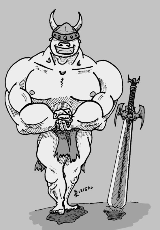
Doc - I really really like the 4th mask, it really makes me say "Gentleman" in the most ominous way possible. :P And everyone else looks excellent, I like that Indiana Jones vibe that Kyanbu's got.  Skweeb - The face looks awesome, and the smoking eyes just add to it all the more. blue - Your progress on the game is impressive, I have to say. Also, I wouldn't say your healer sketch looks like shit necessarily. Rough, sure. :P But you get the basic idea of it. Kyanbu - Immodestly tasteful? Tastefully immodest? I don't know, but it's a nice pose all the same. I can't help but be drawn their chests, maybe it's your colouring? I like it, it's very bright. Do they all wear shiny clothes? I have a picture!  A member of the DeviantArt community is putting together a tribute thing for Frank Frazetta, and as such requested that anyone who's interested to draw up a barbarian. I decided to do it and whipped this up yesterday afternoon, in part because, while I haven't seen much of his work, I have seen enough to be impressed, and in part because I'm on a barbarian kick right now.
__________________
 Aye, num nums indeed.
|
|
|

|
|
|
#4364 | |
|
Blue Psychic, Programmer
Join Date: Feb 2007
Location: Home!
Posts: 8,814


|
Is that an actual Minotaur? I can't decide with the nose and ears. Looks good, though.
I'll explain the thought process on Leann's design. Basically, she's the younger sister of the MC, but she's not just a kid and is in her mid teens. It's basically a more loli version of a standard Alice dress, because in many ways, she's still a kid, but in others, she's growing up. The dress was blue to help highlight her innocence and prevent it from actually crossing over into Gothic Lolita. Actually, one of the villains wears the same outfit in black, which basically takes it over that border. That villain is kind of the antithesis of Leann, because she's also young, but was raised in entirely different conditions, so while they share many of the same base personality traits and the villain is actually quite jealous of Leann's loving support network because the parallels highlight the painful differences, the villain is still quite evil and cruel. The best comparison would be if you set Natalia from Tales of the Abyss next to Kara from White Knight Chronicles. It's not really a close comparison, but the differences in world views are similar. Edit: To be on topic, these aren't new, but I never showed them off before. The blue things on the battlefield are field markers. They probably won't appear in battle given that I'm simply not in the mood to convert all my graphics to fit them (there are a lot of them) after designing them all for flat tokens, but I do have to admit they look good there, so maybe down the line if I find a good way to represent enemies the same way. In order of left to right, top to bottom, you have humans, star children (the magic race), mecha (tanks), angels (healers), and the bottom row all being subtypes of Gaeans: panthers (acrobats), cheetahs (thieves), tigers (barbarians), and wolves (druids). This is a simplified explanation, of course, because it's good enough and I don't want to waste your time with the meticulous details. There are also other races that the player will be able to unlock from side quests and some that are NPC only, too, but I'm hanging on to those for spoiler purposes.  Edit once more: Did a few graphics modifications just to see how they'd look, and while almost all of it translates well to the markers in angle, I just realized there are some serious perspective issues displaying the battlefield that way. For that matter, it made me question whether I might not need to redo some of them to better fit a top-down perspective. I was kind of riding on a "this is virtual" hand-wave, but the increased realism has made me question that. Worst offender: wind spells. The various tornadoes were made in the same perspective as the markers just for clarity, but I've always recognized the issue. Now it makes me wonder if maybe I was allowing myself a bit too much of a free ride by willfully sacrificing realism. Edit yet again: Actually, looking more, quite frankly all of them work either way. Sure, it makes for a goofy perspective with the markers (like they're nailed to a wall), but I wonder if that isn't just as justifiable in its own right as the tokens were. The tokens were literally the first graphics I made for this thing, before it was even thought of, actually. All the graphics were quite literally built around them until I had enough to actually realize I could make a game out of it. It would be rather ironic if they ended up being dropped, especially due to the incredibly arbitrary numbers the graphics are based on (the tokens were done 13x13). I'll have to do some thinking on this. Another edit: These are the insignias for the main races, plus a generic catch-all Gaean insignia for non-player subspecies. 
__________________
Quote:
Journal | Twitter | FF Wiki (Talk) | Projects | Site Last edited by bluestarultor; 05-16-2010 at 12:38 AM. |
|
|
|

|
|
|
#4365 |
|
DA-DA-DA-DAA DAA DAA DA DA-DAAAAAA!
|
Kyanbu - Very nice job on the position of the legs in the picture of the girl posing immodestly. That kind of foreshortening can be a pain.
Blue- Aaah where did her head go? Also the three panel thing could make for some interesting compositions if you do it right. Tophat - Yes, men losing their nipples is an epidemic sweeping across the internet. Raiden is just one of many victims. Your guy looks fortunate enough to have avoided the plague! Also, I love his pose. He's so  I played FF6 again! Sketches! 
__________________
 |
|
|

|
|
|
#4366 | |
|
Blue Psychic, Programmer
Join Date: Feb 2007
Location: Home!
Posts: 8,814


|
CJ: Haven't you ever seen a mannequin before? Honestly! :P
Well, here's her with a head, plus other minor changes. AND COLORING! Crappy coloring, but I didn't feel like manually inking the whole thing for good coloring.  P.S. On the three-panel setup, I'm big on design, so yeah, I'll probably do okay on the composition. I plan on using it to tease people, too. One of my plans is to have there be a love scene in an in-game play. You can probably imagine, but I'll say it anyway: one character on each side, closer, closer, and the viewer is cockblocked by the strip in the middle for the kiss. >) Aside from that, I plan on minimizing image loss by having a lot of sweeping shots just to show everything and show off having it all move at the same time. I originally had old plans for a sort of Limit Break system and what it would look like for selected weapons, but that's since been replaced with a Tech system. Still, I'm considering bringing the styling of the shots back for something, so maybe I'll just have it for selected Techs or maybe magic or something, since I'm on the edge of whether or not to implement multi-user spells. It might be nifty to show the silhouettes in full animation contributing their parts to the spell in triple-screen, or even the whole thing if it's bombastic enough that I don't feel my spell sprites will cover it.
__________________
Quote:
Journal | Twitter | FF Wiki (Talk) | Projects | Site Last edited by bluestarultor; 05-21-2010 at 12:45 AM. |
|
|
|

|
|
|
#4367 |
|
Keeper of the new
Join Date: Apr 2004
Location: A place without judgment
Posts: 4,506


|
 Black Mage vs. White Mage, lawl. Here is a fill-in-your-own-magic-spells version if anyone's bored, cause I find mine lacking.
__________________
Hope insistent, trust implicit, love inherent, life immersed |
|
|

|
|
|
#4368 |
|
Local Rookie Indie Dev
|
CelesJeese - What's with that crazy look on Celes's face CJ? XD Looks great through.
 Annabel Vandalia
__________________

Last edited by Kyanbu The Legend; 05-22-2010 at 11:47 PM. |
|
|

|
|
|
#4369 | |
|
Making it happen.
|
Just a quick doodle I did, trying out a facial expression other than smiling/grinning and frowning, and giving facial structure a little more definition.
 Not really NP Comic material, so yeah.
__________________
Quote:
3DS Friend Code: 4441-8226-8387  |
|
|
|

|
|
|
#4370 | |
|
DA-DA-DA-DAA DAA DAA DA DA-DAAAAAA!
|
Quote:
Quick upload. Marionette Owl from Metal Gear Solid: Ghost Babel.  Looking manlier than he probably should.
__________________
 |
|
|
|

|
 |
|
|