
 |

|
|
|
#4411 | |
|
Blue Psychic, Programmer
Join Date: Feb 2007
Location: Home!
Posts: 8,814


|
Alright. Here are skins I know I'll be using:
Ruby: 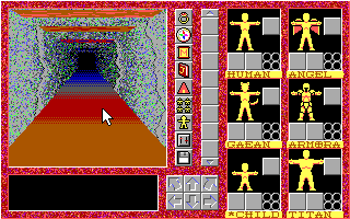 Sapphire: 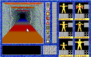 Emerald or Jade: 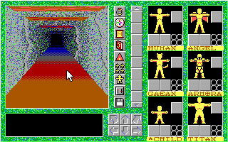 or or 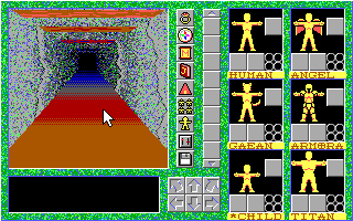 Minimalist: 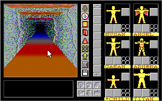 These are ones I'm less sure about: Amber (would likely be the 4th game): 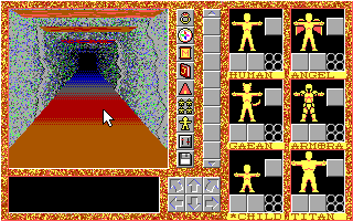 Topaz: 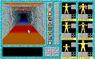 Amethyst/Tourmaline/Something: 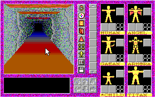 Turquoise:  The question is which of the two greens is better and what to do with the extras, as per the question in my previous post. Edit: While I'm at it, worked some on PoC's interface.  I needed a way to display party stats, so the way it goes is by color coding. Since only four party members are in combat at once maximum, I devoted the first four doubled bars to showing their HP and MP. The last set of bars is the HP of the remaining two members. Jet is gold, Glenn is green, Cy is cyan, Medea is black, Garrott is red, Norman is pink, and Ben and Tiger are teal. (For those of you wondering, yes, that leaves one character unaccounted for. Norman ends up not fighting by the time this would be an issue.) Also, I needed a way to streamline puzzle-solving using commands. Hence putting the orbs up at the top there. The command setup screen will allow the player to not only build pre-defined battle commands to choose from, but will also let you choose five command orbs to have at the ready in the field, plus the GO orb to execute. That's not enough slots to cover all of them, but with a bit of good design, it will hopefully be enough to get the player through an area without having to constantly go back into the menu. All command orbs have an icon inside them, and if visibility is an issue, activating an orb by clicking makes the orb light up to show it better, as shown with the OPEN command. I've done my best to make the icons self-apparent, but the command menu will have a place that lists the name, so it's not totally pictoral. I realize it's a bit cluttered now, but I needed something to fill some space, which is where putting the HP bars there came from, and those have honestly been there for a while. I may end up making it so the center button on the pad actually executed the commands instead of opening up the menu, which is honestly what the original plan was, thinking back to before I was doing this 8x8. I'll probably make it the execute button again and free up the sixth slot for another command orb. The command setup menu can go as a subset of Jet's page, I guess.
__________________
Quote:
Journal | Twitter | FF Wiki (Talk) | Projects | Site Last edited by bluestarultor; 07-26-2010 at 05:21 PM. |
|
|
|

|
|
|
#4412 |
|
Local Rookie Indie Dev
|
Blue- I'd say keep Amber and Topaz.
Though that depends on how many levels/areas you plan on having. Abstract 3 -Pandora Rox-
__________________

|
|
|

|
|
|
#4413 | |
|
Blue Psychic, Programmer
Join Date: Feb 2007
Location: Home!
Posts: 8,814


|
Well, I now have enough to give 7 games 3 related color schemes plus Stone and Minimalist each. That boils down to:
* 3 reds for Ruby: The Calling (Ruby as shown, garnet, and alexandrite) * 3 dark greens for (codename) Ruby II: Emerald (Emerald as shown, a new jade, and bloodstone) * 3 dark blues for (codename) Ruby III: Sapphire (Sapphire as shown, tanzanite, and lapis lazuli) * 3 yellows for (codename) Amber (Amber as shown, topaz (yellow), and peridot (light green, the biggest disparity of the lot)) * 3 light blues for (codename) Turquoise (Aquamarine (shown here as Topaz), Turquoise as shown, and iolite) * 3 purples for (codename) Tourmaline (amethyst, Agate (shown here as Tourmaline), and tourmaline) * 3 whites for (codename) Diamond (diamond, opal, and rose quartz (pink)) Obviously, I don't plan on making 7 games if I can help it, especially given that some colors are simply not going to be desirable (such as the purples, which are all quite pink, and the white/pink set). On the other hand, I have three good sets each for five of them, which, at the moment, sounds like a good enough plan. Five is still possible to handle if it gets that far, and if I need to do six or seven, well, the fans will know I'm digging at that point and they all need to can it. XD
__________________
Quote:
Journal | Twitter | FF Wiki (Talk) | Projects | Site |
|
|
|

|
|
|
#4414 | |
|
Making it happen.
|
Got this idea out of the Corrupted Wishes thread. Right now I'm still hammering out the designs due to the staggering difference in time periods, but I think I can mostly get away with minimal change to the clothing. The hardest part will be weapons/equipment, but...
 First up is the Engineer. Aban is a Legendary Mechanic with a particular fondness for crossbow traps and Pressure Plates. He keeps a hammer for maintenance and for up-close-and-personal work.
__________________
Quote:
3DS Friend Code: 4441-8226-8387  |
|
|
|

|
|
|
#4415 | |
|
Blue Psychic, Programmer
Join Date: Feb 2007
Location: Home!
Posts: 8,814


|
I was messing around with Ruby's logo trying to set it up for the sequels and ended up redoing the text shading to make it much more solid. I mean I do like what I had before to an extent (I prefer the old R), but this comes off as cleaner and better fits how I ended up doing the numbering (in a different font, Castellar, using the square braces).
Ruby: 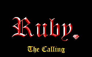 Ruby II: 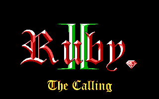 Ruby III: 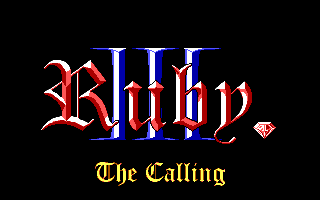 I still haven't come up with subtitles for the sequels, but they'll be centered around Emerald and Sapphire. I'm actually pretty proud of myself. See, the numbers are actually slightly off-center to help align them with the Ruby text, which is set off a bit because of the comma. So it's tricking the eye to think they're centered when they're really not. Edit: Got bored today. I ended up doing logos for all seven potential games (still no snappy subtitles for them all), and made some changes to 2 and 3's.  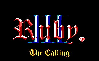 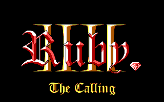 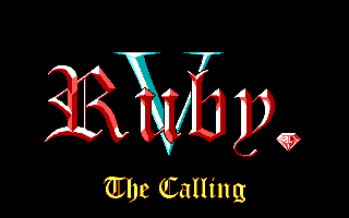 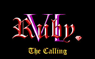 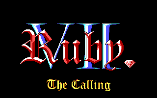
__________________
Quote:
Journal | Twitter | FF Wiki (Talk) | Projects | Site Last edited by bluestarultor; 08-04-2010 at 02:00 AM. |
|
|
|

|
|
|
#4416 |
|
Local Rookie Indie Dev
|
Looks good, you technically don't need much for a subtitle. So I wouldn't stress over it much if I were you.
Red-Night Dread Naught
__________________

|
|
|

|
|
|
#4417 |
|
Unlicensed Practitioner
Join Date: Sep 2007
Posts: 801


|
I need to post more in here. I haven't said much in a while, but there's still a lot of awesome art in here.
I've been reading a lot of Homestuck, so I made a Jaspersprite. I wanted to color it, but I'm not very good at shading/texturing, so I'm taking it one step at a time. I like the middle one best; it's closest to how Jaspersprite looks in-comic, but it's not very detailed. I sort of like the colors in the third, except that I made him look kind of like a flight attendant. |
|
|

|
|
|
#4418 |
|
rollerpocher tycoon
|
Hi internet, I'm going to unload my artistic masturbation on you.
This is my current WIP.  And this is something I started but haven't bothered to finish... 
|
|
|

|
|
|
#4419 | |
|
Making it happen.
|
This would be the second time I've ever tried using oil pastels, the first time in my senior year at highschool. It's fun, but hard.

__________________
Quote:
3DS Friend Code: 4441-8226-8387  |
|
|
|

|
|
|
#4420 |
|
Aim for the top!
|
I finally got to a scanner!
RED HULK AND RED SHE HULK LYRA DEADPOOL FAMILY |
|
|

|
 |
|
|