

 |

|
|
|
#4491 |
|
DA-DA-DA-DAA DAA DAA DA DA-DAAAAAA!
|
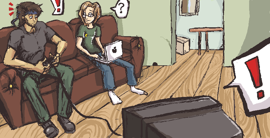
Thanks XD The other artist and I got together again to draw tonight:
__________________
 |
|
|

|
|
|
#4492 |
|
DA-DA-DA-DAA DAA DAA DA DA-DAAAAAA!
|
Double postin' because you all aren't sick of my art yet. (hopefully >: )
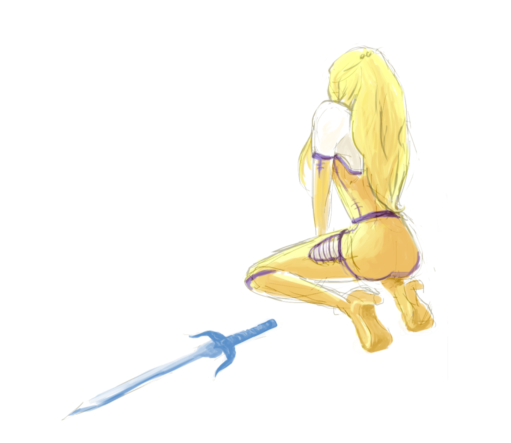 Saw a fanart, decided I liked the style, attempted to mimic it. Photoshop is a jerk and I had to screencap and lose all of my layers. Oh well. It was fun to do.
__________________
 |
|
|

|
|
|
#4493 |
|
Fate Averted
|
|
|
|

|
|
|
#4494 |
|
adorable
Join Date: Sep 2007
Posts: 12,950


|
I've been continuing to refine my sprite making skills. I'm getting better, I think.
 EDIT: Finished a walking animation. I'm more or less happy with it. 
__________________
this post is about how to successfully H the Kimmy
Last edited by Kim; 03-24-2011 at 01:55 AM. |
|
|

|
|
|
#4495 | |
|
Blue Psychic, Programmer
Join Date: Feb 2007
Location: Home!
Posts: 8,814


|
Well, I was busy on my days offline. Here, have an example of what a real character sheet will look like and some battle bars:
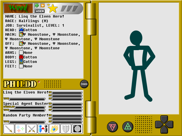 The middle set of bars is, in fact, for a real NPC, who will use both magic and technology. The other stuff is just filler. Also, I decided 20 characters should be enough for players to adequately express themselves. Honestly it goes a lot further than I'd expected. Oh, and a couple changes to the interface on the character sheet. I decided the "friend star" was just a waste and made it into a "rating star" so players have a way to tell who's a shitty potential party member or duelist or player in general. Most of the ratings stuff is automatic to avoid people being asses and revolves around holding up battle and other stuff. That smaller star there is the new "friend dot" and will change color along with the rating star. Lastly, I decided to toss in a way to flip between marker-based and token-based battle at will. Marker-based is prettier, but token-based is easier to tell what's going on and move through. Hence the new button on the bottom down there on the right of the row. The various flags will still pop up, but they don't leave an empty space when they're gone.
__________________
Quote:
Journal | Twitter | FF Wiki (Talk) | Projects | Site |
|
|
|

|
|
|
#4496 |
|
adorable
Join Date: Sep 2007
Posts: 12,950


|
 Walking forward animation.
__________________
this post is about how to successfully H the Kimmy
|
|
|

|
|
|
#4497 | |
|
Blue Psychic, Programmer
Join Date: Feb 2007
Location: Home!
Posts: 8,814


|
Non, I'm noticing what seems to be pixels not being preserved on the left side of the sprite there. It's on the facing sprites, too.
Past that, he reminds me of a teddy bear walking, in a good way.
__________________
Quote:
Journal | Twitter | FF Wiki (Talk) | Projects | Site |
|
|
|

|
|
|
#4498 |
|
adorable
Join Date: Sep 2007
Posts: 12,950


|
The weird thing is that in all those instances tinypic is the one causing it. I don't know why, but I've done double-takes and rechecked the actual sprites I'm using and the missing pixels are there. ~bizarre~
Thanks for the compliment, though.
__________________
this post is about how to successfully H the Kimmy
|
|
|

|
|
|
#4499 | |
|
Blue Psychic, Programmer
Join Date: Feb 2007
Location: Home!
Posts: 8,814


|
So I finally have the perspective worked out for Feng:
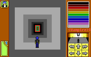 It took moving him down on the screen a bit, but I'm pretty happy with the parallax. Basically, starting at the red, all colors are "super-black" indications of things that are there, but that Feng can't normally see. He'll get skills to see them as flashing objects and such, which is why they need to be kept track of. Also, I realize it's not totally square. I'm going for a kind of parallax and I'm quite happy with the effect. The perspective works well with each individual surface despite not keeping the same shape. Also also, yes, that's "visible" behind him. His senses are strong enough that he can keep track of things immediately behind him with precision befitting sight, so I figure the player should be allowed to see it. My only regret is that the size I gave him doesn't allow room for a second tile in that direction if I want to keep the size I have planned for the world. Que sera. I also have the status and inventory screens at the point, but I won't bore you with just showing text placement. Next up will be the system screen, which I also won't bore you with.
__________________
Quote:
Journal | Twitter | FF Wiki (Talk) | Projects | Site |
|
|
|

|
|
|
#4500 |
|
Keeper of the new
Join Date: Apr 2004
Location: A place without judgment
Posts: 4,506


|
So I randomly found a gorgeous picture of space. It looked too coincidental to determine if it was an amazing photomanipulation to begin with or just space being awesome, but I couldn't let that stop me. I had to carve out the romantically entangled couple I saw trapped in the stone (so to speak), and in the process attempt to build another kind of beauty from the original image. So I broke out the crayons and drew all over it:
 I'm not sure it's any improvement. But now you know.
__________________
Hope insistent, trust implicit, love inherent, life immersed Last edited by Amake; 04-17-2011 at 03:37 PM. |
|
|

|
 |
|
|